

Uplift K12
Website Redesign
A new learning platform designed to promote collaboration between students and teachers.
Overview
The Product: Uplift K12 is a virtual learning platform that enables teachers to collaborate with students through math manipulative and research-based activities.
Timeline: 5 Week sprint
Team: 4 designers & myself
Tools: Figma, Maze, Trello, Procreate
My Role: I focused on designing various elements of the platform, including the homepage, message center, mood tracker, and awards. I also created illustrations of the platform's mascot, the Yeti. I served as the design project manager, overseeing meetings with the founders, conducting user interviews and research, drafting timelines, and ensuring we stayed within budget.
Uplift K12 is an organization that focuses on using math manipulatives and gamification to help students with disabilities learn math effectively. However, the program is currently facing low utilization rates among students and teachers. Since students cannot access Uplift without the help of their teachers, there is not enough student involvement to make significant improvements in their learning outcomes.
Problem

Solution
Create an intuitive student dashboard based on gamification and motivation insights. Our goal is to allow students to independently review their assignments, track their progress, and communicate with their teachers. By providing students with greater autonomy and accessibility, we aim to increase their engagement and motivation, resulting in improved learning outcomes.


Approach
Before proceeding, our team sought to answer a critical question: "How can we leverage Uplift K12's existing elements to develop a student-facing dashboard that enhances participation among both students and teachers, while ensuring organization and accessibility?" Keeping this question at the forefront of our minds, we embarked on our research process, which involved conducting interviews with both teachers and students, as well as carrying out comparative analyses of comparable educational platforms.
Research & Insights
Our team carried out user interviews with teachers and students who possessed prior experience with online learning and worked to identify their values and distinctive needs. Subsequently, we crafted personas that embody our target users, such as Beth, an empathetic teacher, and Ben, a student facing challenges learning. Our objective was to obtain a more comprehensive understanding of teachers' unique requirements, students' varying learning styles and motivations, and to pinpoint any obstacles they encountered along the way.
“Personalization is an opportunity for students to step into their learning and engage with it”

Some key insights I gathered:
Teachers emphasized that authenticity and curiosity were crucial elements for developing rapport with their students. They further observed that students could detect insincerity, fracturing the trust between them.
Teachers also required clear means of communicating with their students, monitoring their progress, and providing necessary assistance.
A lack of motivation in students did not necessarily indicate disinterest. Many students had different learning styles, and what proved effective for one may not be suitable for another.
Finally, customization and a reward system proved to be essential in motivating students to participate in various activities.
In addition to conducting user interviews, our team delved into the potential advantages of gamification in educational settings. To do this, we reviewed existing literature on the topic and examined how Uplift's competitors incorporated gamification into their platforms. This enabled us to identify current trends and best practices. Based on our findings, we created a survey that was distributed to a diverse group of students across multiple grade levels.
Our research revealed that students who were involved in gamified learning experiences were more engaged, motivated, and enthusiastic about the subject matter. They also reported a greater sense of accomplishment and pride in their achievements. Additionally, we discovered that gamification aided in the development of problem-solving and critical thinking abilities while improving retention of information among students.


Design Studio
Taking into consideration our targeted user personas, we embarked on the process of compiling our research and generating sketches to conceptualize our project. During the preliminary stages of sketching and creating wireframes, our key objective was to integrate the three crucial elements that we had uncovered in our research: Rewards, Communication, and Personalization. By prioritizing these elements, we were able to establish a cohesive structure within the site that facilitated a conducive learning environment for both students and teachers.
Our research informed us that providing avenues for feedback, personalization, and rewards would be crucial in keeping Ben engaged while learning. In light of this, we developed the following features:

Homepage
Enabling the homepage to effortlessly showcase assignments, earned rewards, and feedback.
Furthermore, we aspired to integrate a mascot that can interact with students across the entire platform, fostering a more engaging and immersive learning experience.


Awards Page
Providing access to a range of features such as activities, progress tracking, feedback, and more. Additionally, incorporating a help button that allows users to easily reach out to their teacher.
To motivate students, we incorporated a reward system where students can earn gems from their assignments and badges from their teachers. These tangible awards go a long way in incentivizing students to perform better than verbal feedback alone.

Skills


Designing a dedicated page that empowers teachers to showcase their students' accomplishments and skills. This feature can serve as a source of motivation for students, inspiring them to aim higher and achieve greater success.
Usability Testing
We conducted preliminary usability testing by using mid-fidelity wireframes to assess the users' ability to navigate through the system without any difficulties. To achieve this, we enlisted the participation of both teachers and students and had them share their screens over Zoom while they navigated through the system. The students were accompanied by their parents throughout the testing process.
We had 5 teachers and 5 students complete the following 6 tasks within the Maze:
Log in
Pick a mood
View a message from the teacher
Respond to the message
View an assignment
We decided to use mid-fidelity wireframes for this step instead of greyscale because we believed colors and images would be more helpful for students to navigate. We observed the participants via Zoom to capture their facial expressions and body language as children may be hesitant or shy to share their thoughts.
Our usability test results showed that we had some issues to work on. Our users struggled in a few areas.
Mid-Fidelity Wireframes
Homepage
Users pointed out that our homepage was too busy and cluttered. In addition, they expressed that having a calendar and help button seemed unnecessary.
Assignments
Users stated that having the titles of the assignments over the images can cause some visibility issues.
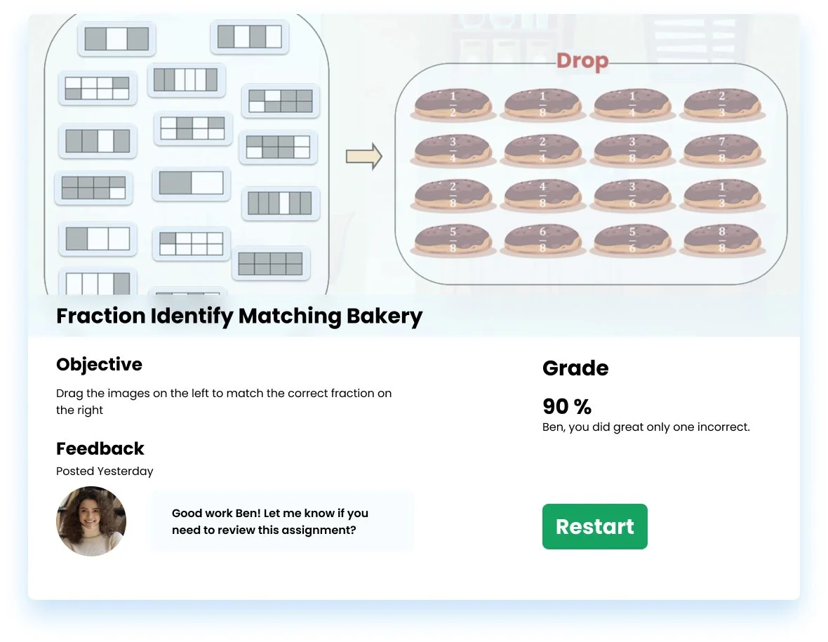
When users click on the assignments, a pop-up section appears that provides them with a summary. Users really appreciated this page because it shows feedback and grades in relation to the assignment.
Messages
Users stated that we should remove past messages in order to reduce the amount of clicks. They ultimately wanted us to prioritize simplicity for students.
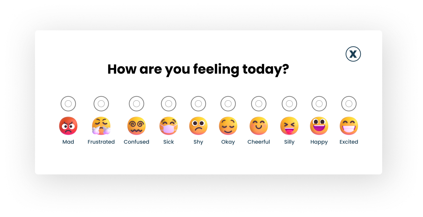
Mood tracker
Based on our research, we knew that personalization motivates and helps keeps students engaged. We had created this mood tracker so that students can change it daily and signal to their teacher if they are feeling uneasy. When tasked to pick a specific mood, users let us know that it can be confusing without names for the emotions.


Iterations
Following the results of our usability tests, we identified areas requiring improvement. Our main objective was to promote accessibility by making our designs simpler and clearer. The outcome of our second round of testing demonstrated successful progress.
Homepage Iterations
Within the homepage, we added our mascot. We also simplified the homepage layout by removing unnecessary tools and simplifying our navigation bar at the top.

Meet Yasmin the Yeti!

I was tasked with illustrating a new Yeti. I used procreate (an illustration tool) to draw the yeti and add some personality to the mascot.
Uplift K12's branding included a yeti mascot that appears upon signing in. Our goal was to incorporate the mascot throughout the platform to create a sense of fun and familiarity for students. By using the mascot in various ways, such as introducing new concepts or reinforcing important information, we aim to enhance student engagement and motivation in the learning process
Assignment Iterations

For our assignments page, we changed some colors and moved around the “to-do” and changed “Revisit” to “ Completed Lessons”.
Mood Tracker Iterations
For the mood tracker we added clear names for all the emojis and added buttons to help indicate when a mood is selected.

Awards Iterations
We updated the “Progress” page to now be the "Awards” page. We added our mascot and removed details on grades and top subjects. The page now focuses on celebrating student achievements and inspiring them to excel.
Final Outcome
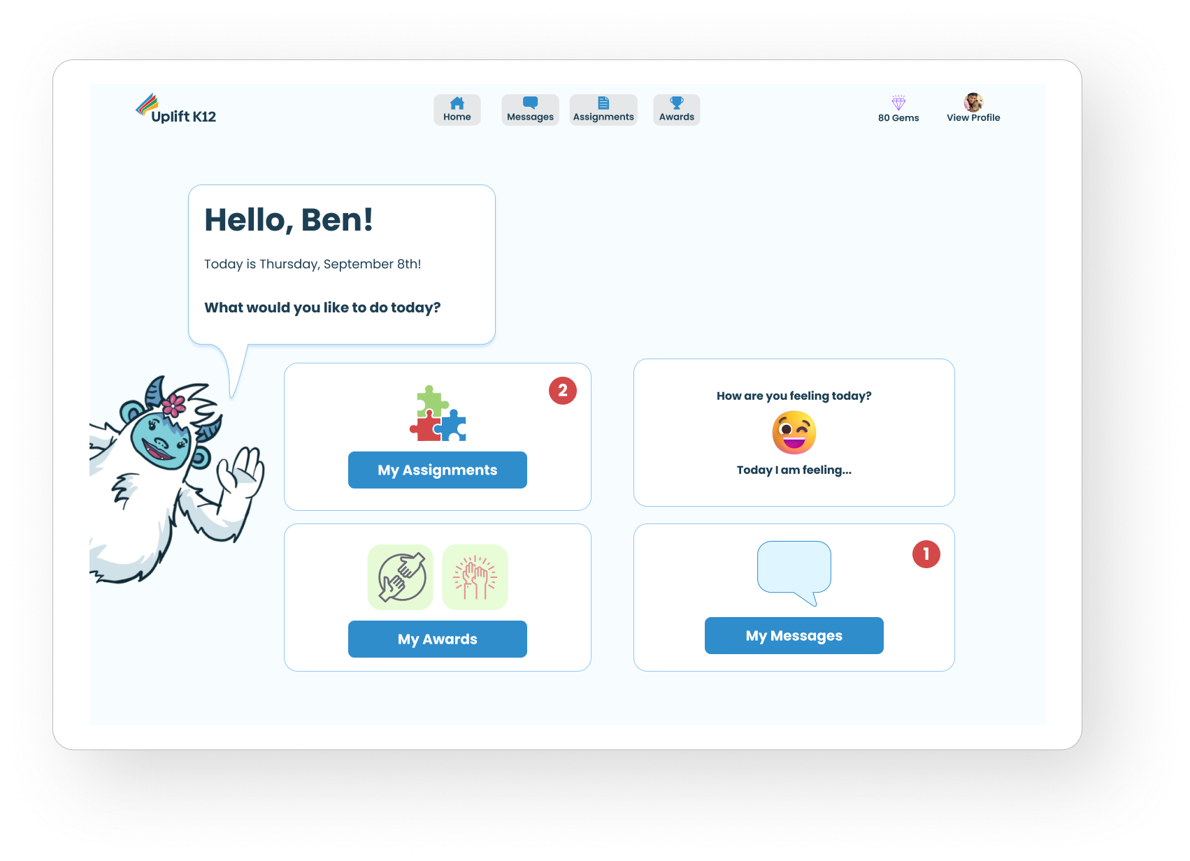
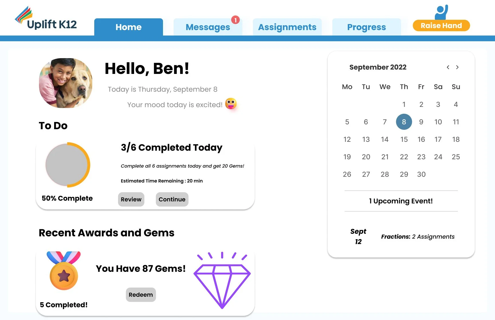
Homepage
Creating a homepage that prioritizes simplicity.
Our final iteration of the homepage includes a simplified layout of our original design. We made sure that our homepage greets students with Yasmin the Yeti, who welcomes them and offers a variety of actions for the student to choose from, including accessing their assignments, viewing their awards, messaging their teachers, and changing their moods. These four aspects all align with the main takeaways we learned from our research, which emphasized the importance of personalization, communication, and rewards.
Awards
Creating an awards page to promote student participation through personalization.
Our awards page follows the same simple and minimalistic approach as our homepage. Students can view their awards, gems, and strengths. By allowing students to personalize their experience on our platform, we empower them to take ownership of their learning journey and feel more invested in their education. Simple and modern navigation also helps to reduce cognitive load and make the platform more accessible to all students.
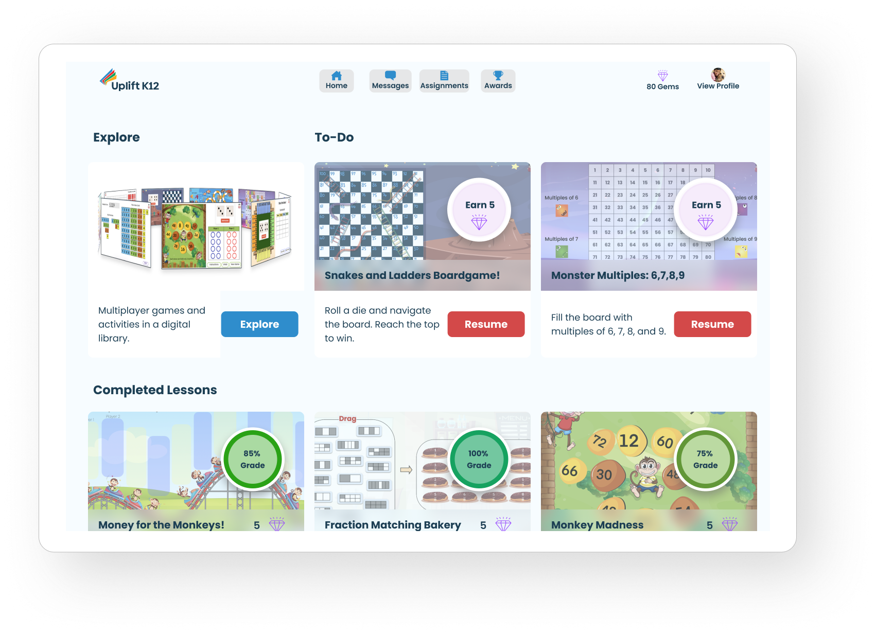
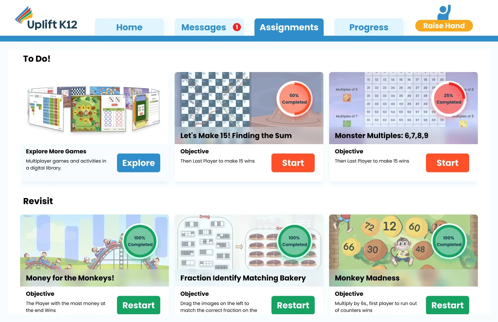
Assignments
Creating a way for students to take control of their learning.
Our assignments page allows students to view past assignments and review their strengths and weaknesses. They can also see any direct comments from their teachers. Additionally, they have the option to redo any assignments, whether it be for practice or simply for enjoyment, allowing students to take control of their learning.
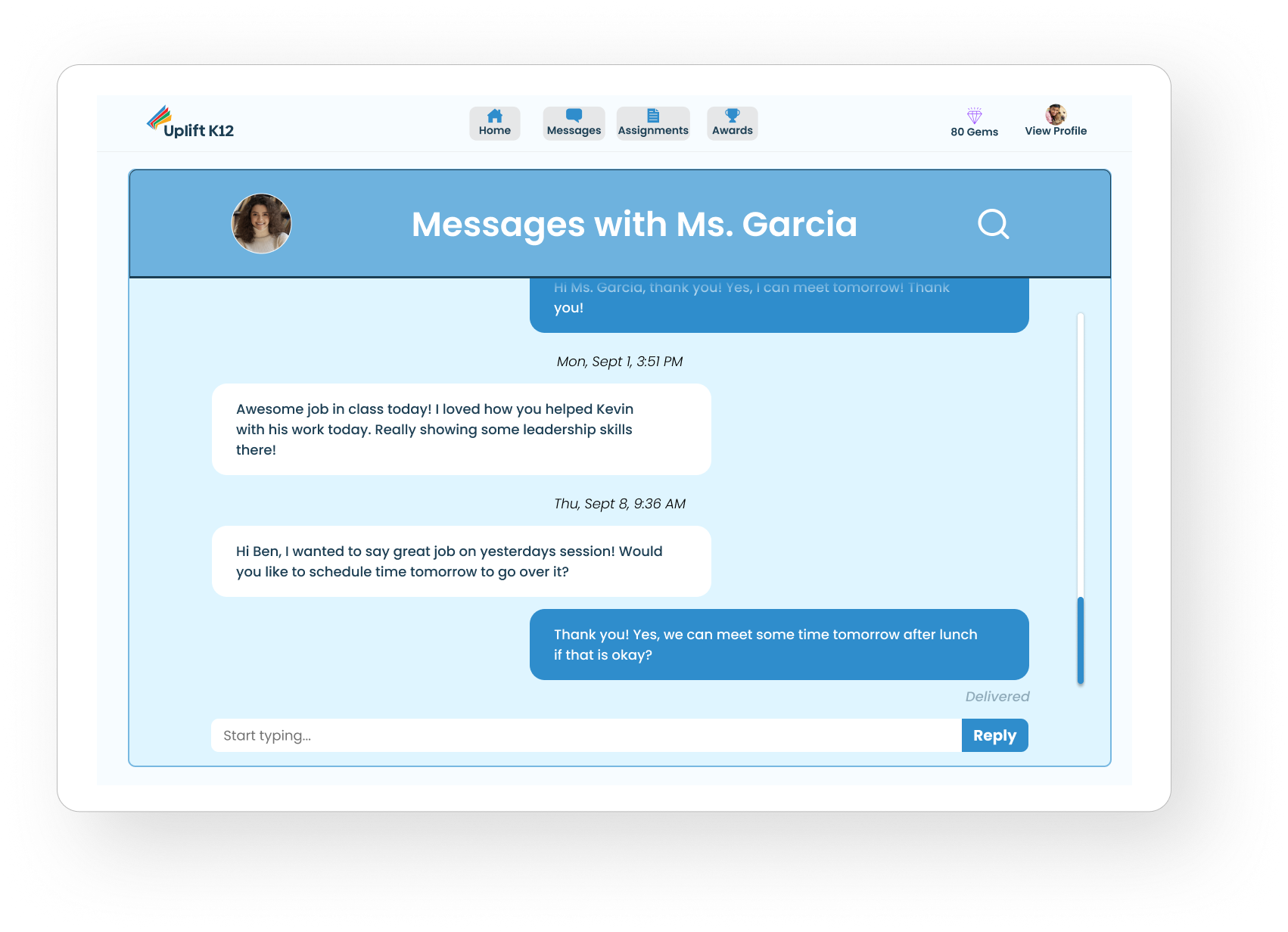
Messages
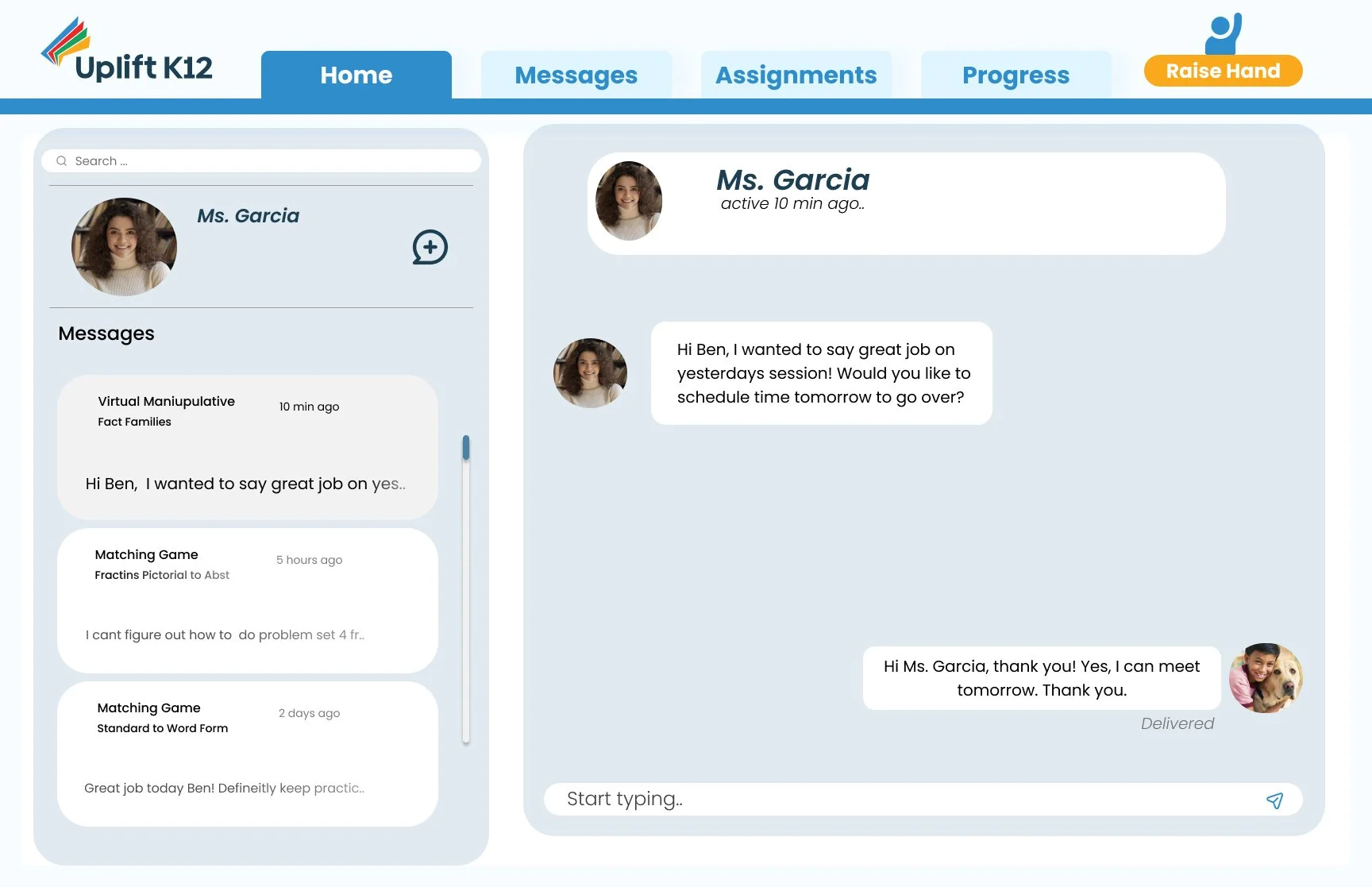
Allowing students to communicate with their teachers.
Our Messages page allows students to directly message their teachers. Students can ask their teacher for help and schedule extra support sessions. Our research showed that many students are hesitant to ask questions in class due to the possibility of feeling vulnerable in front of their peers and the potential for bullying. Therefore, a message center was very important to us as it provides a safe space for students to communicate with their teachers.
Reflections & Moving Forward
Working on Uplift was an incredible experience that allowed me to pursue my passion as a designer by contributing to a startup that is dedicated to helping others. Throughout this project, my team and I honed our ability to effectively engage with stakeholders and clients. Over the course of five weeks, I experienced tremendous personal growth, assuming leadership roles within the group and helping to guide our efforts through adversity.
Looking ahead, I am eager to explore opportunities to contribute to the teacher-facing side of the platform, which was initially part of our scope, but had to be deprioritized due to time constraints. Despite this, I am proud of the work we accomplished and am grateful for the opportunity to collaborate with a client that shares our commitment to empowering students.
We invite you to take a look at our prototype below and experience the platform for yourself.